In this blog Etoile Info Solutions, a renowned company, delivering pragmatic and result-oriented SEO services in Phoenix is here to impart some new found discoveries made possible by heatmaps, specifically when it comes to increasing conversions.
Visitors look left: Vistors tend to spend more time looking at the left side of the website. So it’s beneficial to put vital information that you want your visitors to see and read on the left side of the website. But this might be different for languages that are read from right to left rather than left to right.
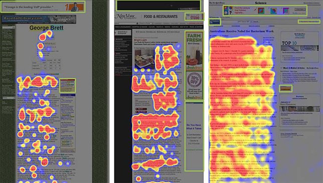
Upper Left, Most Looked Area: The upper left-hand side is the most looked area of a page- visitors spend more time looking there than anywhere else on a page.
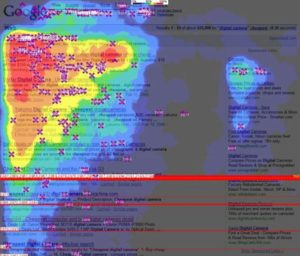
With Scrolling Attention Span Diminishes: The more you let your website visitors scroll down, the less interested and engaged they get. So if you’re incorporating an essential conversion element on your website at the bottom make sure you are putting it at the very bottom.
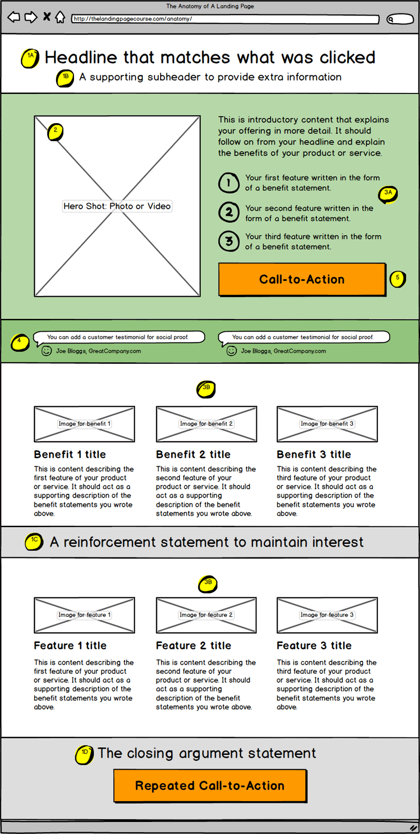
What you find appealing is what you buy: According to a study by Caltech, when it comes to high-speed shopping, graphics play a very important role than consumer preference. What you want to sell and what you want the visitor to buy must pop out. This means visually attractive images are an effective conversion tool.
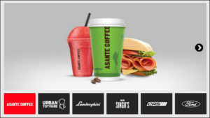
Avoid carousels: Carousels aren’t much of a help in boosting your conversions. They are only effective if your customers don’t have any specific goal or item in mind. But if that isn’t the scenario restrain yourself from incorporating home page sliders.
A/B Testing is crucial: Believe us A/B testing in combination with heat maps can do wonders. Picking out design patterns from different page designs will only multiply your output. So test different page designs and finalize those you feel can optimally put forth your brand.
