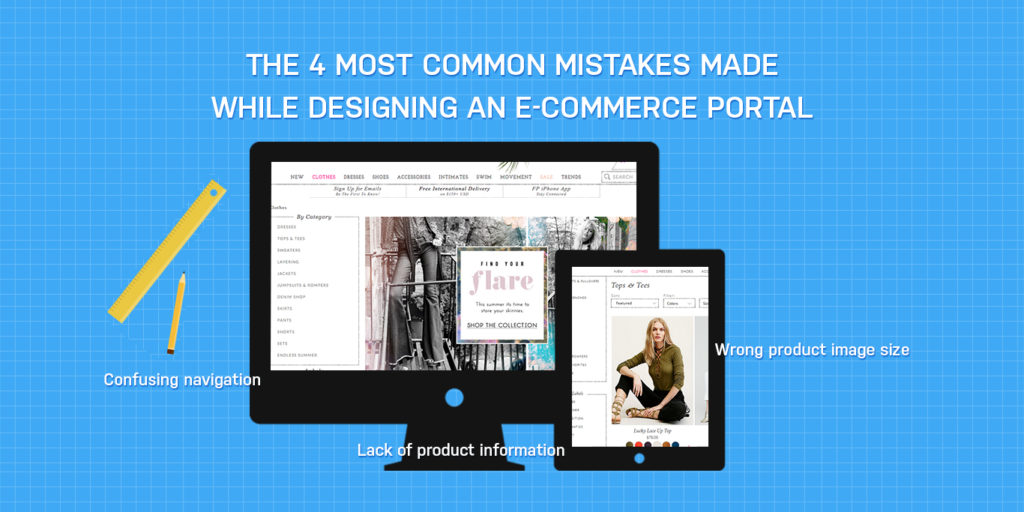
The 4 Most Common Mistakes Made While Designing an E-commerce Portal

Online selling demands constant updating of the e-commerce website. It’s not as straightforward as installing a shopping cart software. It requires immense forethought, planning, and a rich technical expertise. Taking advice from e-commerce web designers is the best thing to do, if one does not want to land up with error messages and navigational issues that are big enough to annoy or infuriate the customer.

common-mistakes-ecommerce

Some common mistakes committed during the e-commerce site designing process are as follows:

  1. Lack of product information

Since online shopping eliminates a direct interaction between the buyer and the seller, therefore, it becomes imperative to mention all the possible product details. Customers always look for specifications about a product along with its price and related discounts. If they are not content with the information provided on the screen, they are likely to move away from the site.

  1. Complex checkout process

A complex checkout process may cause much irritation to the customer. It may also result in a longer time for the site to load. Combining two pages, like putting billing and shipping details next to each other, seems to be a good option, as it makes the process appear shorter.

  1. Wrong product image size

Images between 1MB-3 MB are the best to use. Large images take a lot of time to load and therefore, may trigger resentment among users, sometimes even causing them to leave the site. On the other hand, small images look poor in quality when downloaded. By taking the help of professional website designers, companies can choose from a variety of e-commerce website design that perfectly suit their business needs as well as the expectations of their audience.

  1. Confusing navigation

It’s a must for e-commerce sites to apply simple navigation schemes for the ease of usage for visitors. It starts with simple things such as labeling categories & having products under them, opting for a minimalist design, and many more.

The above-mentioned are only a few of the mistakes that companies commit, while embracing an e-commerce venture. However, by taking guidance from the best e-commerce web design company, such as Web Solution Centre, one can surely avoid these blunders. One may contact this company for building a new portal or revamping an existing one.

4 Surefire Tips for Designing a Successful Mobile App

is best to avail the help of an experienced mobile app development company to build a good mobile app.

Mobile app design

A good mobile app is one that has neither very few features, nor too many. A paltry number of utilities would render it useless, while, too many of them will make it suffocating and overwhelming to use. Building an app requires proper forethought, planning, and a well-informed decision to be taken. Of course, it is always best to avail the services of a reputed mobile app development company, which would ensure that it is functional, user-friendly, and productive. Cited below are a few suggestions that should be followed during the mobile app design process.

  1. Make them Lightweight

A good app is one which neither consumes too much memory, nor utilizes too much storage. Using very many physical resources not only impacts lag-time in phones, but also increases the time it takes to launch the app. If it is an alternative to a mobile website, it should be able to launch quicker, than it takes to load the specific website.

  1. Consider Premium Options

If it is supposed to generate revenue, ads should be incorporated during the design stage in a manner, which does not hamper the user experience. Paid options should always be kept as a standby, if the target users want an ad-free experience. However, it is important to note that a free version sounds good, but a paid one makes it easier to recover the cost incurred during the designing period.

  1. Aim for Code Abstraction

Cross platform applications are best benefited if the company ensures that the code is abstracted. In other words, the user experience should be independent of the screen size or the platform used. 

  1. Test, Test, & Test

It is imperative to test the app before its final launch. In fact, it is important to test often. Further, it is essential to evaluate its performance across all the platforms.

An app will be at its greatest potential if its users undergo an exclusive experience. By taking the help of an experienced mobile app design company like Web Solution Centre, one is assured to get instant success. This company has a proficient team of technicians who are adept at providing the best solutions in this aspect.

3 Best Practices That Guarantee Success in E-Commerce

Attaining high conversions on an online shopping portal is not that difficult, if one makes the use of an attractive and intuitive E-Commerce website design.

ecommarce website

For an e-commerce portal to be successful, it is important that the company undertakes strategies towards attracting traffic as well as converting them to customers. Search engine optimization proves to be helpful in increasing the traffic on a website. Through this technique, visitors do get attracted to the website, but the conversion still remains low. This is where the design, content, and marketing take the spotlight. An expert E-Commerce web design company would exactly know how to improve conversions on any e-commerce website by harnessing the potential of these tactics. Listed below are a few of the best practices that help in attaining success in e-commerce:

  1. Art of virtual story telling

Statistics reveal that a viewer merely scans a website instead of going through all the content. If there is nothing that grabs the attention of the customers, the bounce back rate increases. Large chunks of text with mere factual information can never hold the interest of a customer for long. Therefore, it is important that the content tells a story, which would instantly garner the attention of the visitor.

  1. Entertaining and engaging the audience

Even an e-commerce website needs to entertain its customers in order to retain them. A highly functional, user-friendly, and intuitive ecommerce website design is imperative in order to engage the customer. Special offers for visitors are common, but providing the coupons as a result of a small quiz or poll creates immediate interest amongst the customers. Special privileges for the loyal customers tend to attract more conversions.

  1. Let the customers know that the organization is reliable & trustworthy

By incorporating testimonials and genuine reviews from the existing customers, the company can enhance the credibility of the products & services it provides. Displaying a sign up count on the website shows new customers the number of members who deeply trust the organization. Utilizing a popular figure as a brand ambassador also highly influences conversions.

Of course, there are several other ways of generating leads as well as increasing conversions. For more tips, one can always rely on the proficient team of ecommerce web designers of Web Solution Centre, a trusted name in the industry.